
If you’re like me and work in a role where you’re measuring project financials or various growth metrics, it’s always nice to have a dashboard where you can see all your metrics in once place. In this post, I’ll show you how to create a custom dashboards using Confluence and Google Sheets.
Before we get started, it is assumed that your data is already in a Google Sheet, or you can get your numbers into one. I’ll then demomonstrate how embed Google charts from your data into a Confluence page, creating a real-time dashboard.
Ready? Ok, let’s go!
First up you’ll need to log into your Google account and head over to your sheet(s) which houses your figures.
I’ll assume that you know how to create charts in Google Sheets, if not, just Google it, there will be many great resources showing you how.
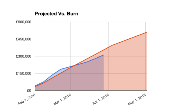
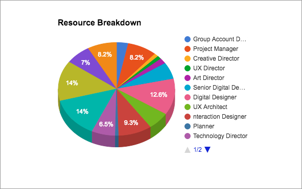
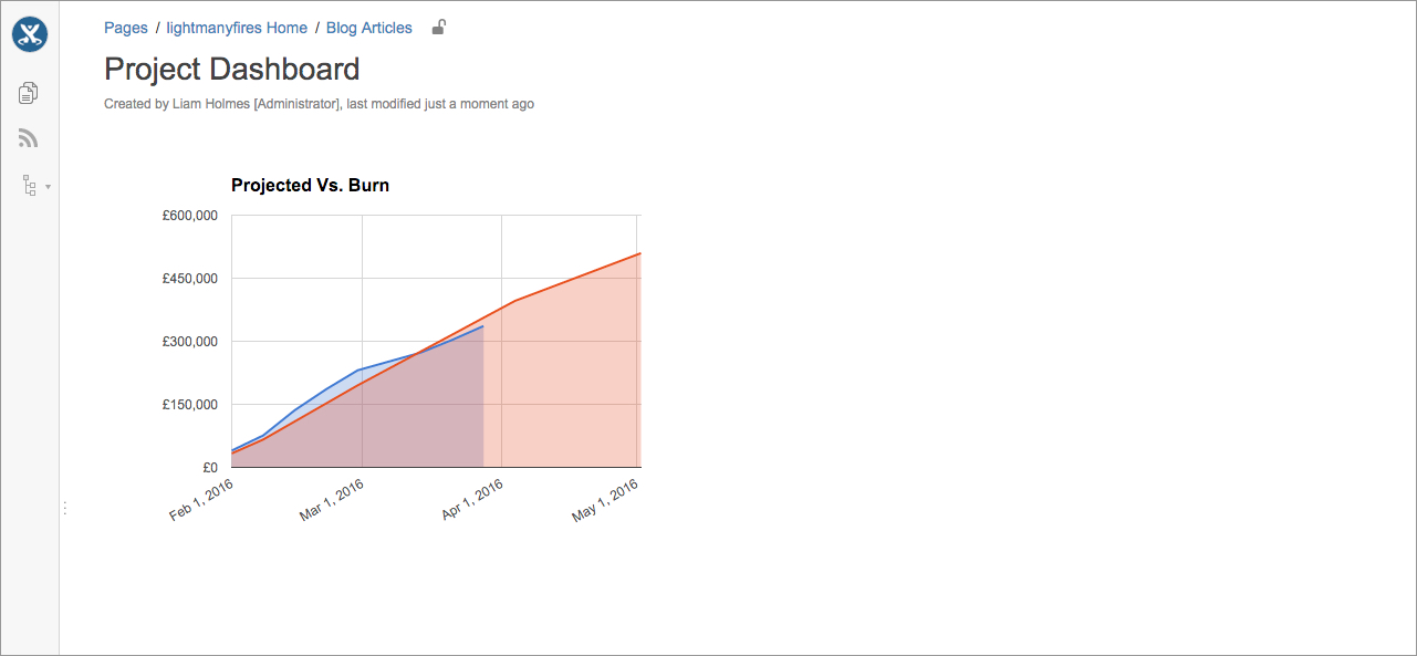
In the following example, I have a fictitious project in which I’ll be displaying the current burn versus projected cost of the project, and the respective resource breakdown.
However, your charts don’t have to be financial related; they could be growth metrics of your startup or social media campaign statistics. If you can plot a chart of it in Google sheets, you can get it into a dashboard! Below are screen shots of the two Google charts that I’ll be embedding to a Confluence page.
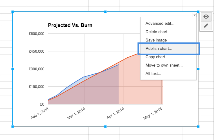
Ok, let’s look at the first chart. In the top right-hand corner of the chart, toggle the dropdown menu and select “Publish chart…”
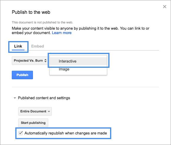
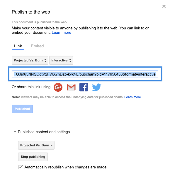
You will then be presented with the following modal window. Select the “Link” option and make sure the “Interactive” chart option is selected. That way you’ll have interactivity when you mouse over the charts in Confluence. Also, make sure that the “Automatically republish when changes are made” check box is ticked. That way when either you or you colleagues update the data in the sheet, those changes will be reflected on the chart in your dashboard. Once you’re done, click the “Publish” button.
 Next, you will be presented with the link to the published chart. Copy this to your clipboard and/or paste it somewhere where it will be readily available, we’ll need it shortly.
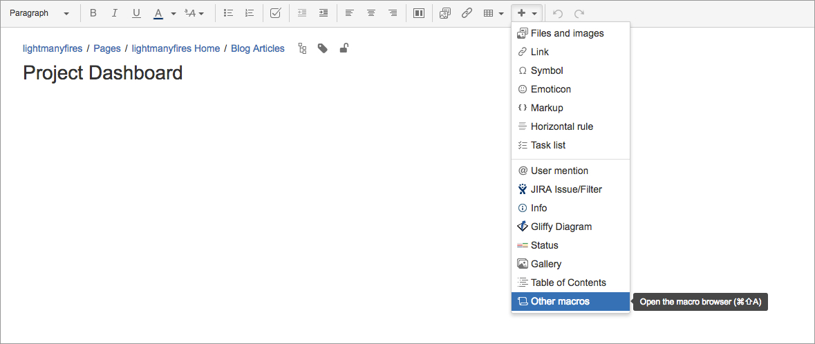
Now, if you haven’t already, create your dashboard page in Confluence, then go into edit mode. From the macro’s dropdown select “Other macros”
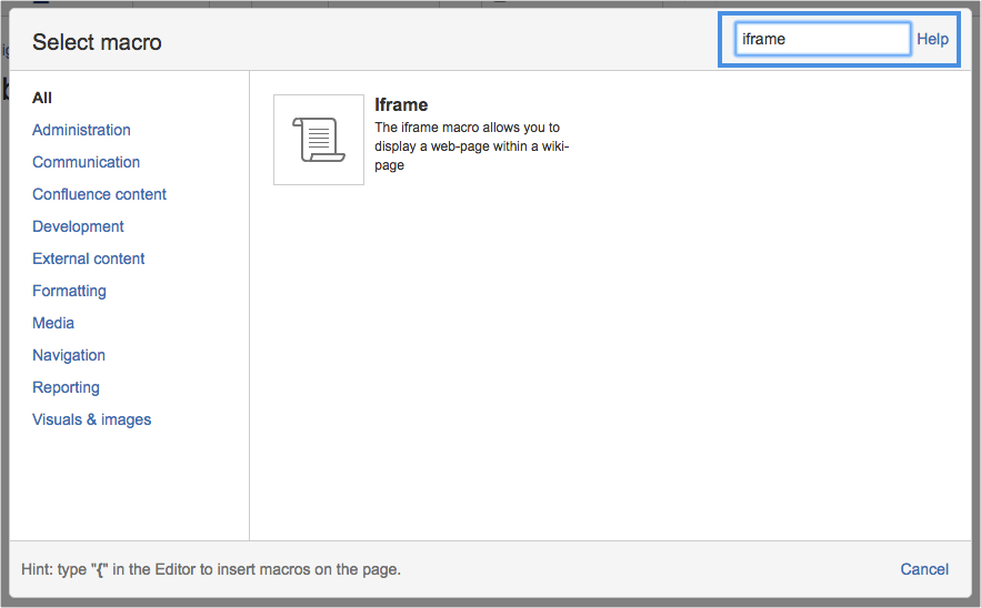
From the modal window, search on “iFrame” in the search field in the top right-hand corner. Then select the iFrame macro from the displayed search results.
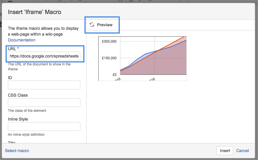
Now, grab that URL from your published chart and paste it into the URL input field, then hit the “Preview” button as seen below.
You should see the chart displayed on right-hand side of the modal window, however, we’ll have to do some tweaking.
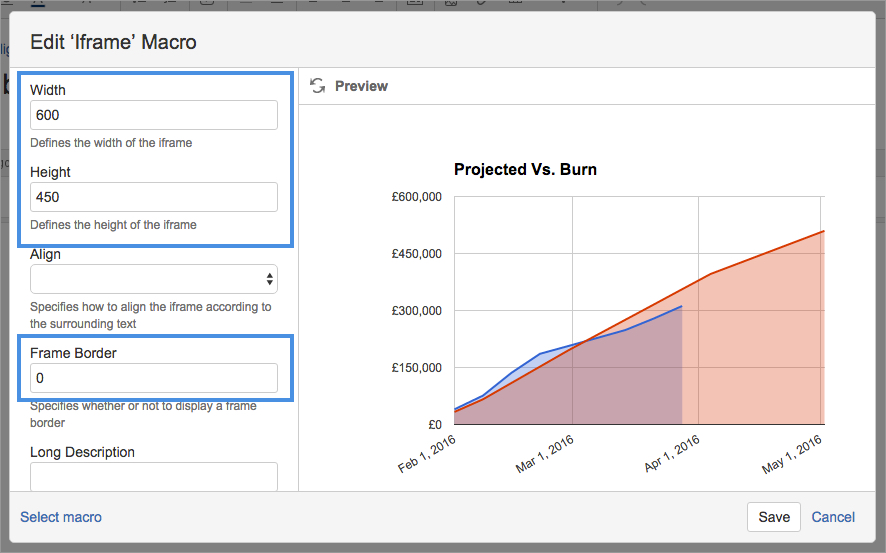
You will have to modify the height and width of the iFrame, that way you won’t don’t get the horizontal/vertical scroll bars in your final display.
This may require you to save and view the final display, then jump back into edit mode and tweak as required.
Also, in order to remove the default border around the iFrame add ‘0’ into the Frame border input field.
Once your done editing hit “Save”.
Now that you have saved your page, you should see your embedded chart. If you’re still seeing scroll bars around your chart, you’ll have to modify the width and height dimensions as above. If this doesn’t work, you may have to alter the size of the chart in your Google doc.
Now following the same steps for the additional chart, you’ll see below that we have our beginnings of our dashboard, complete with interactivity as you mouse over the charts.
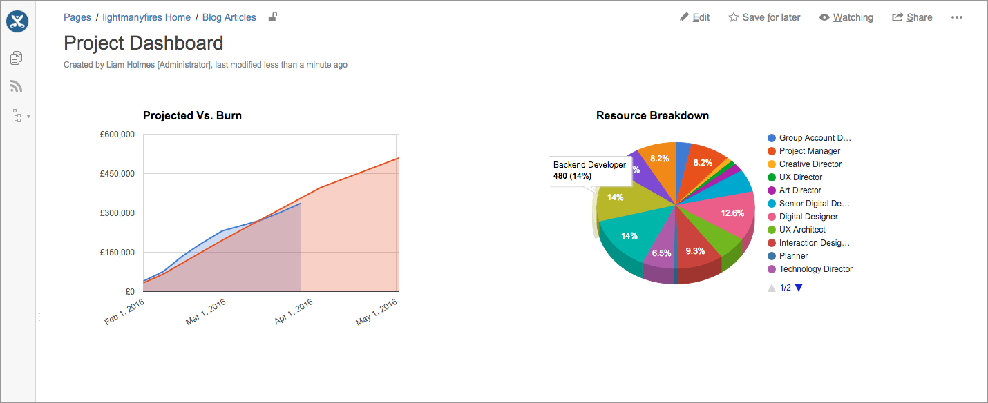
So that’s it! pretty easy to make awesome looking custom dashboards, no need to stop at two charts, add as many as you like! Now when either yourself or your colleagues make updates to the respective Google sheet(s), the charts will be updated on page refresh of your Confluence page!
I hope that gives you a few ideas on how you can introduce custom dashboards into your organisation.
Happy charting!
Liam