Consider how much time both yourself and your team spend in Confluence. Wouldn’t it be nice to have a user interface to navigate through your space that’s intuitive to use and easy on the eyes?
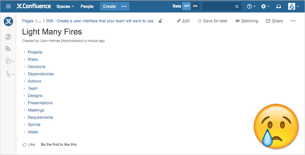
How often do you see parent pages like the one below using the Page Tree macro to display its subpages? Or worse yet no navigation at all, merely presenting the user with a blank parent page? It would be excellent if we could give these parent pages a bit more life, especially on the spaces home page.
Well today, we’re going to do just that. We are going to create an awesome user interface at the top level of your space that both you and your team will love!
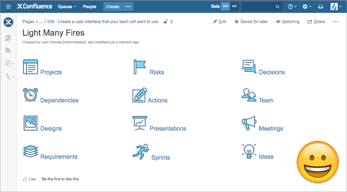
The goal: Create the following navigation user interface in Confluence
Before we kick-off, I would like to mention the choice of icons and linked pages used in this example won’t be appropriate for all projects. This post is about simply illustrating the concept. You will have to adapt your interface to the needs of your specific projects and teams.
With that disclaimer out of the way let’s get going!
1. Make room on your space’s home page
I am working on the assumption that you will put your interface at the top level of your space. You may already have some information present on your space’s home page. To make room for your interface go into edit mode and clean out whatever is not essential.
2. Break your page up into sections
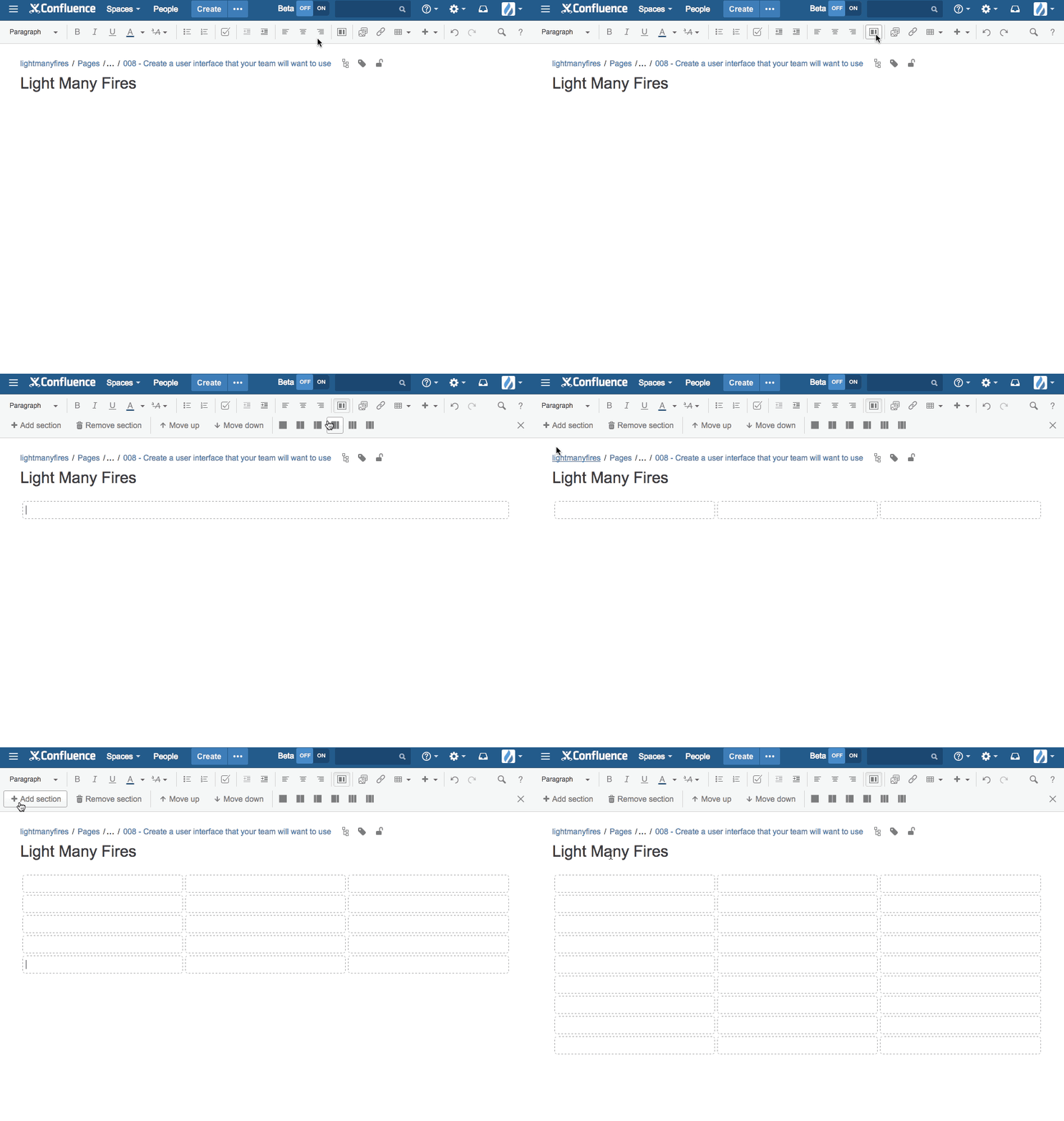
To achieve the desired layout, break up the page using the 3 column layout icon in the rich text editor. Then add multiple versions of that layout to house your icons and provide vertical spacing between the icons.
3. Add the icons and text
The icons used in this example were a pre-existing icon pack that I downloaded from Flaticon created by Freepic. If you like the look of these icons, then give them a run. However, why don’t you involve your team and ask your designers to whip up some icons? Make your project space home page even more relevant by using icons which reflect your organisation’s or client’s style guide – your designers will surely be happy to help 😉
To add the icons and text to your page you’ll want to do the following:
- Drag the icon into the correct section of the page.
- Resize the icon if required. In the example above the icons are 50px.
- Add some text next to the icon to describe where the text and icon will link to. For example “Projects”.
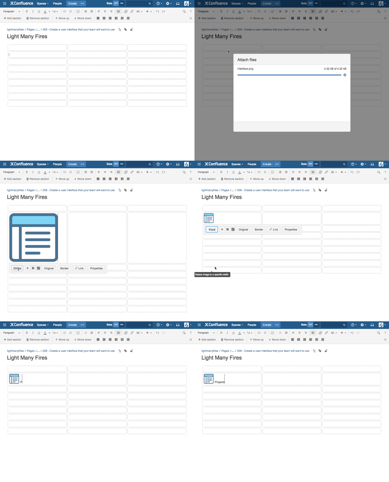
4. Link the icons and text to the relevant pages
Link both the icon and it’s corresponding text to the required page. This way if someone clicks on either the text or the icon they’ll be linked through to the intended page.
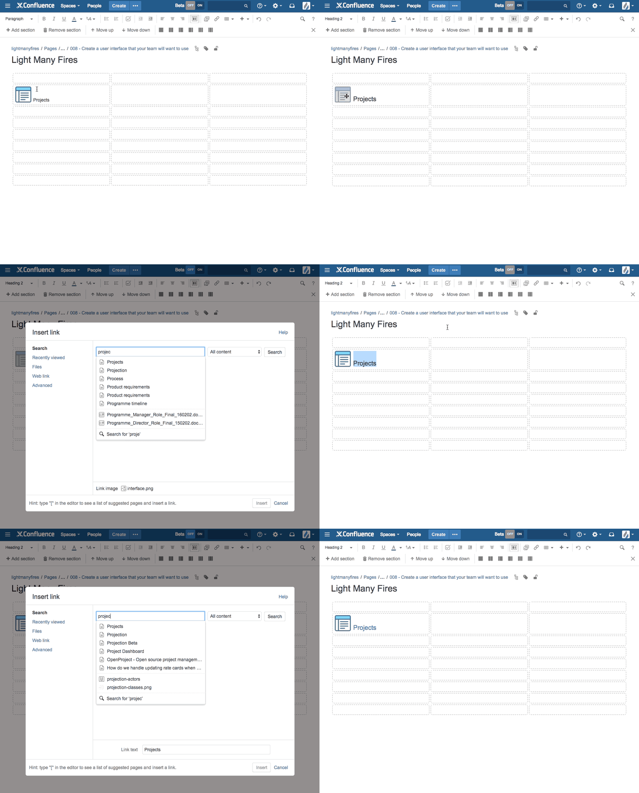
Repeat this for the rest of your icons and save your page.
Finally, one last thing.
5. Show off your brilliant work
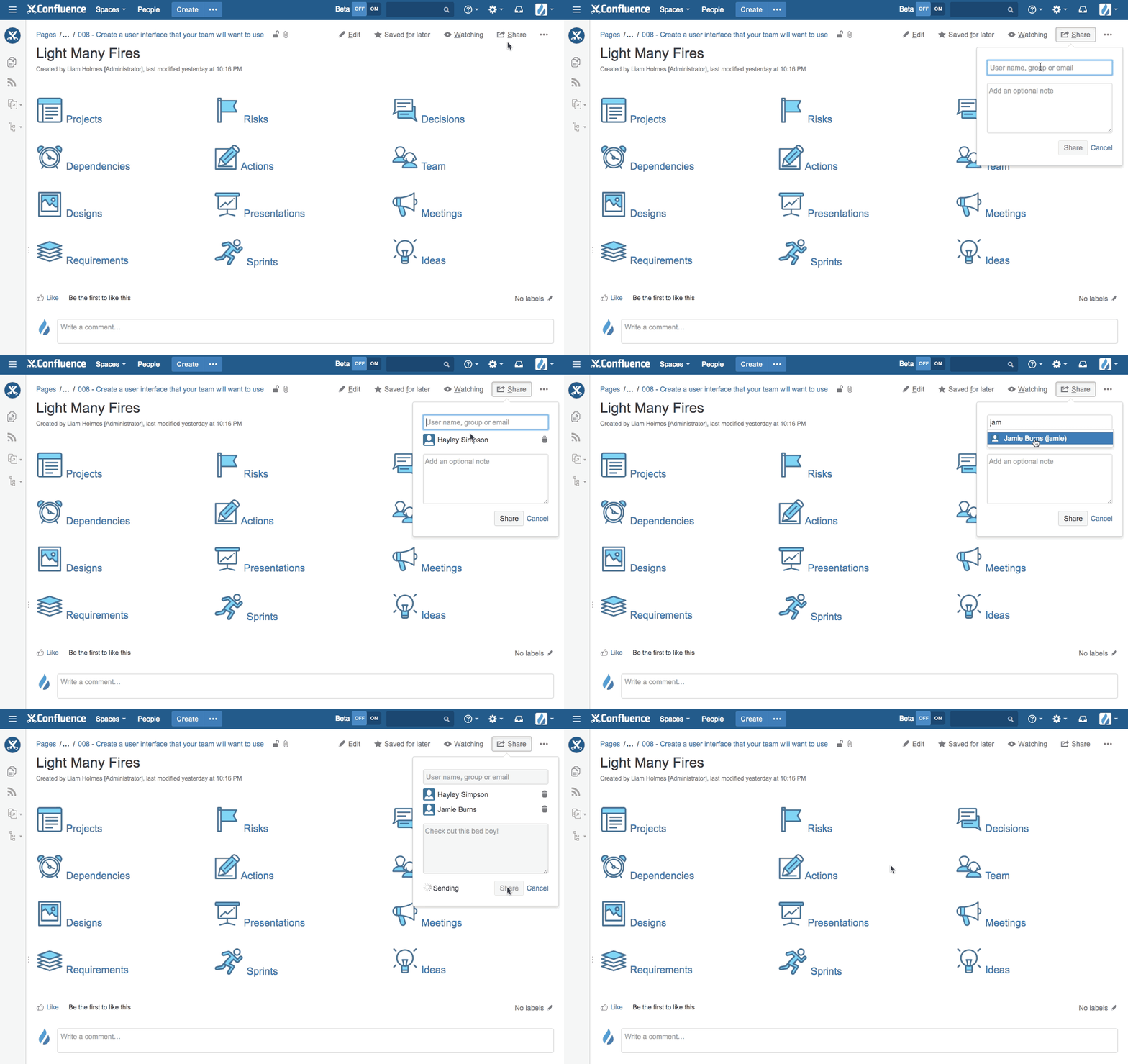
Now that your kick-ass interface done and dusted, don’t forget to share this bit of awesomeness with the rest of your team!
SOURCE HBO.COM
As always, I hope you found this post useful. If you have any friends or colleagues that would also enjoy this post, please share it with them!
If you have any questions or comments, please leave them in the comments section below. I’ll get back to you as soon as I can.
Liam


